It Wants to Be
One of the first things I learned as an interior designer is that a space and the elements within a space should speak to you. There are rules in the design world that we follow in order to create unified compositions and enhance the interactions we have in a space. Many times with staging we are presented with design challenges within already defined rooms that may need slight adjustments, so anyone entering the home feels like the space is right for them. Some of these challenges include creating an impactful consistency throughout the home along with visual interest. Staging is not meant to be a means to hide your home's imperfections but a tool to highlight the established architecture and character of your home. Variety, rhythm, balance, emphasis, and economy are all important factors to consider in design and in staging.
When I was first introduced to Melville Ave. I was intrigued by the story this house had to tell. It exuded a presence with almost every room containing a fireplace intricately crafted, providing a clear focus to each space. The house just kept going and going, moody with personality around every corner. All I could think was how cool it must have been to grow up here.
The owners expressed their reservations with staging. So much love went into this house, and they were proud of the decisions they made throughout the years to maintain its integrity. Making drastic changes right before saying goodbye felt uncomfortable to them. Previous realtors stated that in order for them to get their top asking price, they needed to replace big ticket furniture, upgrade light fixtures and do a complete paint overhaul to lighten up all the wood. I didn't agree and neither did their current realtor. We felt that the house wanted to remain true to its inherent style and staging the home would simply involve highlighting this style. We quickly developed a plan of attack and strategized by making a list of each room's design challenges and came up with solutions. You can absolutely pull out all of the stops to showcase your home to its fullest potential, however, you should not overspend or sacrifice architectural integrity for what's on trend. You can bridge native architecture with contemporary furnishings and accessories to achieve a remarkable look.
By referring to the rules of design below, I worked with the client to make decisions about which pieces to replace and encouraged simple upgrades to artwork and accessories (they had some great pieces)! In turn I learned a lot from the client. After all, they had lived in their home for over 20 years, so they knew it best.
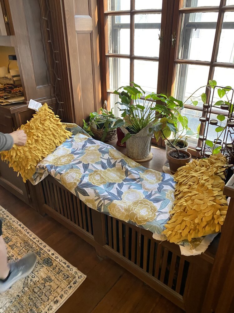
Variety - Each room had some type of well-crafted built-in shelving. We used interesting accessories sparingly on shelves to highlight the architecture and area of focus. Rugs, blankets, pillows, and artwork provided strong contrasts to a fairly neutral wall color and dark trim. The client had some vintage prints of birds that she wanted to use. By simply replacing the dull, worn mats in the frames, these pieces got a second life and worked really well in the space.
Rhythm - Accessories were curated to follow a repetition from room to room by following similar spacing patterns, so parts of each room were equally accented and didn't feel too heavy or too light. The idea was for the objects, colors, artwork, and furniture to follow a rhythm, so everything communicated and didn't feel disjointed.
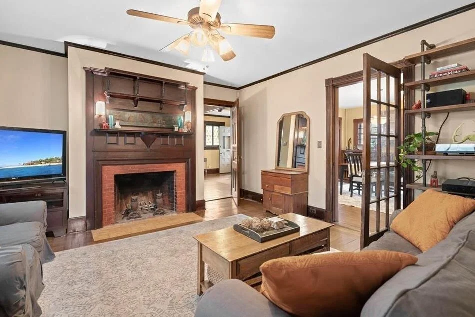
Emphasis - The fireplaces served as emphasis in each space, so the accents and artwork were minimal to simply highlight the details. The dark trim on the first floor was carried throughout the second-floor bedrooms, so linens, rugs and window dressings stayed very light.
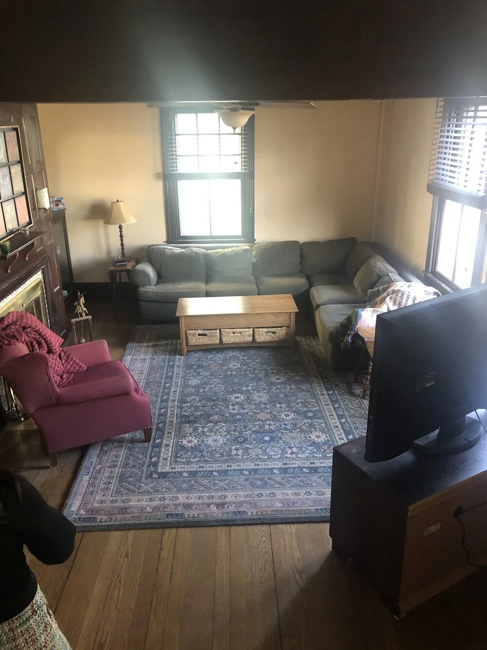
Balance - With tall fireplaces and floor to ceiling built-ins in almost every room, there were already very established, bold focal points. The furniture remained subdued with a variety of pillows adding color and texture. The TV was initially floating in the formal living room with the back facing anyone who entered the home. By relocating the TV to the family room, the formal space was able to regain its purpose and balance. Additionally, by using smaller scale chairs with classic lines the architectural details remained the center of attention.
Economy - We replaced the rugs in the dining room, family room, master bedroom, and study for contrast and reupholstered the dining room chairs (DIY), re-matted frames, swapped furniture, and edited. The goal was to show off this home using only what was needed to create the intended effect, which was to not distract from this big, old, intricate beauty while saving on cost.
The Before
The After


